Data visualisation is the art of translating data into visual elements like charts, graphs, and maps to make it easier to understand and interpret. It’s taking a bunch of numbers and turning them into a picture that tells a story.
Resource
This is a test banner
Data visualisation is the art of translating data into visual elements like charts, graphs, and maps to make it easier to understand and interpret. It’s taking a bunch of numbers and turning them into a picture that tells a story.
Provided by: Net Zero Go


Data visualisation is the art of translating data into visual elements like charts, graphs, and maps to make it easier to understand and interpret. It's taking a bunch of numbers and turning them into a picture that tells a story.
Data visualization can help :
Data visualisation is used in all sorts of fields, from science and business to journalism and education.It's a powerful tool that can help us understand the world around us in new ways.
Data visualisation isn't just about colorful charts and graphs. In the realm of energy projects, it's a powerful tool for:
Data visualisation comes in a number of flavours which depend on target audience, use case and cost. Some examples of impactful visualisations are
Data visualisations assess the effectiveness of energy policies, informing evidence-based decision-making and continuous improvement.
Good data visualisations need to be
Here's a breakdown of some key types and their use cases:
|
|
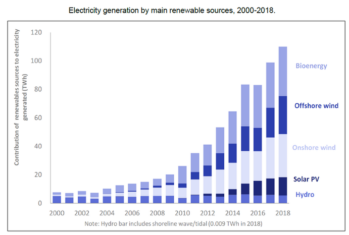
Bar Charts: These trusty old rectangles shine when comparing discrete categories or values. Think website traffic for different pages, sales figures for different products, or survey responses. UK GOV | Electricity generation by main renewable sources, 2000 to 2018 |
 |
Line Charts: Ideal for showcasing trends and changes over time, like temperature fluctuations, stock prices, or website visitor growth. |
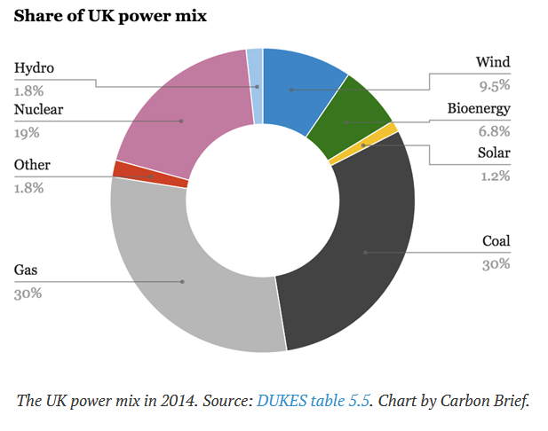 |
Pie Charts: Divide and conquer with pie charts, perfect for visualizing parts of a whole, like budget allocations, survey breakdowns, or market share distribution. |
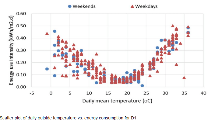 |
Scatter Plots: Reveal relationships between two numerical variables with a constellation of dots. Analyze correlations between advertising spend and website visits, study the link between temperature and ice cream sales, or explore the connection between housing prices and square footage.
|
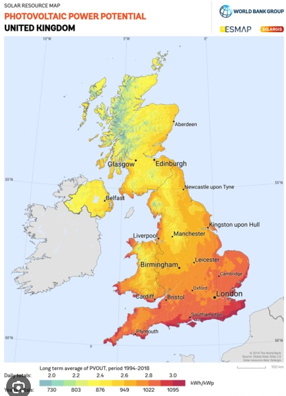 |
Heatmaps: Transform temperature maps into versatile tools for analyzing data across geographic areas, website clicks, or even sentiment analysis on social media. Identify hot spots of activity, gauge regional trends, or visualize user behavior patterns. SolarGIS | solar resource maps and GIS data for 200+ countries and regions |
 |
Histograms: Dive deeper into the distribution of a single numerical variable. Imagine the height of students in a class or the length of blog posts – histograms reveal how frequently each value appears, showcasing patterns like skewness or normality.
|
 |
Choropleth Maps: Paint the picture with color! These geographically-aware maps associate colors with data values, enabling you to visualize things like election results by region, air quality variations across a city, or population density on a country map. |
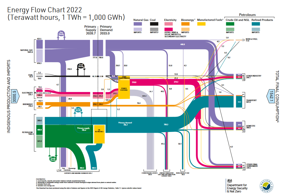 |
Sankey Diagrams: Flow like the data flows! These visualizations trace the movement of data between different categories or stages, making them ideal for understanding customer journeys, financial transactions, or supply chains.uk choropleth mapos Department for Energy Security and Net Zero | Energy Flow Chart 2022 |
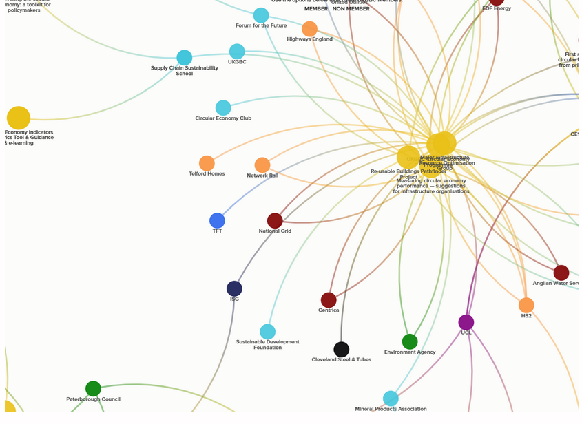 |
Network Graphs: Unravel the web of connections with nodes and links. Use them to map social networks, visualize academic collaborations, or explore relationships between proteins in a cell. |
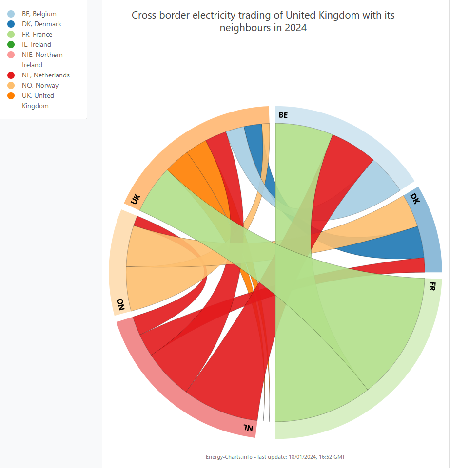 |
Chord Diagrams: Untangle complex relationships with these circular visualizations. They reveal connections and flows between multiple entities, depicted as arcs linking segments on a circle. |
Designed to aid Local Authorities in developing robust, evidence-based plans to enable Net Zero.
Already have an account? Login
 Guest preview of selected publicly available resourcesFull library of 1,000+ articlesCPD accredited e-learning coursesCase studiesDiscussion forum